One of the main challenges of designing a museum or exhibition is the problem of creating a viewer experience that is informative and accessible to an audience that ranges in age, interest, and background knowledge. In most cases, the museum is able to create a user-friendly experience; however, one often encounters at least one item or exhibition that is unsatisfying in some way. Whether this is because the viewer does not find the item interesting or because they simply don’t ‘get it’, the issue usually comes from something very simple: a lack of context.
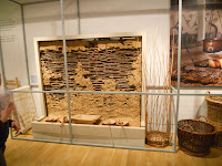
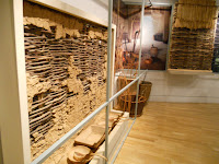
 There are two artifacts in the museum of London’s Ancient London exhibit that I would like to examine, one of which I find to be ineffectively presented, and the other of which I find to be exceptionally well presented. The first item is an example of a simple wattled and daubed wall. The artifact stands against the far wall of the exhibit and is set behind a minimal barred structure to keep viewers from disturbing the other items featured alongside the wall, a feature which includes a series of typical cookware items and baskets from the period, as well as several photographs depicting example buildings that a wall like the one shown would have been a part of. The photographs also show the interior of one such building, depicting paintings that would have covered the smooth daubing of the walls. To the left of the artifact, there are several small panels listing the photographers and the locations in which the photographs were taken.
 Beyond the aforementioned panels, there are no labels or signs giving information about the wall, the photographs, or the artifacts shown. The result of this is that anyone who approaches the item, attracted by the colorful pictures and the interesting set up, becomes rapidly disengaged due to the lack of information. The result is an exhibit that is eye catching, but uninformative and forgettable. Personally, I was drawn to the artifact because we had recently spoken in class about that particular building technique, and I was interested to see an ancient example of it. I was, however, disappointed to find that the exhibit provided me no historical context with which I could develop some kind of understanding about the history, use, and significance of these objects.
 This is a problem that could have been solved very easily. By providing a label with a comprehensive heading such as “Deconstructed example of a typical [insert culture here] home” and then explaining the context of the wall in more detail below, the exhibit would allow the viewer an at-a-glance context for the object, as well as the option to more comprehensively learn about this context by reading on below. I was surprised that the museum had made this choice, especially because this wall was not the only item which did not have information provided alongside it. The display itself is beautiful, and it is well situated to feature the objects. However, it is the story of an object that allows us to understand it—without that, why should we care?
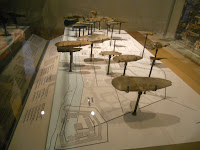
 Just a few steps from the example home is a display which I thought was especially well presented. This display, called “London Before Londinium,” showed examples of different stone tools, each of which was placed on a map over the location where it was discovered. This map not only depicted the layout of the Roman city, it also included a few comparatively modern landmarks to help provide a sense of the area to a contemporary viewer. Above the glass case where the artifacts were shown was a large photograph of modern London showing the footprint of the Roman Londinium in white lines. Next to the photograph was a poem written by a modern poet titled “AD 50” which provokes the reader to “imagine the world beyond the city, that country a lifetime away…”
 This display works well because it is accessible on several levels. The first is visual: the large photograph of a recognizably modern London, the map, and the stone tools all allow the viewer to get a quick sense of what the display is going to describe. Next, the poem and its title provide a sense of time and give the viewer an idea of what he or she is being asked to do. Finally, the detailed label below gives more detailed information about the display, the items, and the era that they represent.
 It is unfair to judge a museum or display for not fully describing a time or concept, because of course no collection of items can fully do justice to the richness of history as it was happening. A museum can only hope to give a viewer a basic sense of what the exhibit is trying to describe. However, when a museum is unable to communicate to the viewer any context for what he or she is looking at, there can be no hope of said viewer walking away having gained anything from the experience. Though the museum does a very good job of showing a wide range of items and eras, it falls short in some places where it could really convey a strong sense of what London might have been like when these items were in use. By simply providing more information in an accessible, concise way, items like the wattled and daubed wall have the potential to be informative and, ultimately, help provide a better understanding of the relationship of modern Londoners to the history of the city.
No comments:
Post a Comment